Learn the 7 basic quality tools with simple explanations, real-world examples, and practical uses. Discover how these essential QC tools help identify problems, improve processes, and boost quality.
Every business has problems. Orders arrive late. Products come out with defects. Customers complain about the same issue again and again. The good news is that you do not need to be a data scientist to fix these problems. You just need the right tools.
The 7 basic quality tools are simple, easy-to-learn methods that help you find problems, understand why they happen, and check if a fix actually worked. They were first put together by Dr. Kaoru Ishikawa, a Japanese quality expert who believed that ordinary workers, not just engineers, could solve most quality problems on their own. You can read more about his work on the American Society for Quality (ASQ) website.
These tools are used in factories, hospitals, offices, schools, and software teams. They do not need expensive software. A pen, paper, and a bit of data are often enough to get started. In this article, you will learn what each tool is, when to use it, and how to read it, in plain and simple language.
What Are the 7 Basic Quality Tools?
The 7 basic quality tools are a set of charts and methods used to study data and solve problems. They are called “basic” because they are simple to learn, yet they can solve about 90% of the quality problems most teams face. Here is a quick look at all seven tools before we go into detail.
| Tool | Main Purpose | Best Used For |
| Check Sheet | Collect and count data | Tracking how often a problem happens |
| Pareto Chart | Rank problems by size | Finding the few causes that matter most |
| Cause-and-Effect Diagram | Find root causes | Team brainstorming on a single problem |
| Histogram | Show data spread | Seeing the pattern in a large set of numbers |
| Control Chart | Watch a process over time | Spotting unusual changes early |
| Scatter Diagram | Show a link between two things | Checking if one factor affects another |
| Flowchart / Stratification | Map steps or sort data | Finding where a process breaks down |
1. Check Sheet
A check sheet is a simple form used to collect data in a clean and organized way. Instead of writing notes on random pieces of paper, you use a check sheet to count how often something happens, such as a defect, a delay, or a customer complaint.
When to Use a Check Sheet
- When you need to collect data by hand at the place where work happens
- When you want to count how often a problem occurs
- When you need clean data before using other tools like a Pareto chart
Simple Example
A hotel front desk team wants to know why guests complain. They make a check sheet with common complaint types listed down the side, such as “slow check-in,” “noisy room,” and “wifi issues.” Every time a complaint comes in, staff put a tally mark next to the right type. After one month, they simply count the marks to see which complaint happens the most.
2. Pareto Chart
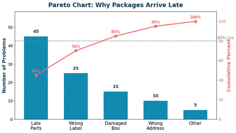
A Pareto chart is a bar chart that ranks problems from the biggest to the smallest. It is based on the Pareto Principle, also called the 80/20 rule, which says that about 80% of problems usually come from about 20% of causes. You can read a general explanation of this rule on Investopedia’s Pareto Principle page.
A Pareto chart uses bars to show how big each problem is, and a line on top to show the running total. This helps you spot the few causes that create most of the trouble, so you know exactly where to focus first.
When to Use a Pareto Chart
- When you have many problems but limited time or money to fix them all
- When you need to show your team or manager which issue matters most
- When you want to check progress after fixing the top cause
Simple Example
Looking at the chart above, a delivery company finds that “late parts” and “wrong label” together cause about 70% of all late packages. Instead of trying to fix five different problems at once, the team focuses only on these two causes first. This saves time and gives faster results.
3. Cause-and-Effect (Fishbone) Diagram
A cause-and-effect diagram, also called a fishbone diagram or Ishikawa diagram, is used to find the root cause of a problem. It looks like the bones of a fish, with the main problem written at the head and possible causes branching off like bones.
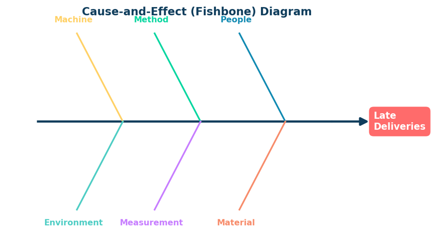
Causes are usually grouped into categories to make brainstorming easier. A common set of categories is:
- People: skills, training, or staffing issues
- Method: the steps or process being followed
- Machine: equipment or tools used
- Material: the parts or supplies used
- Measurement: how data is gathered or checked
- Environment: the workplace or outside conditions
When to Use a Fishbone Diagram
- When a team needs to brainstorm every possible cause of a problem
- When the real cause of an issue is not clear or is easy to argue about
- When you want to organize ideas from a group discussion
Simple Example
A software team keeps finding bugs after each release. During a meeting, they draw a fishbone diagram with “software bugs” as the head. Under “method,” they note that testing is often skipped when deadlines are tight. This turns out to be the biggest cause, so they fix their release process instead of just blaming individual coders.
4. Histogram
A histogram is a bar chart that shows how data is spread out. Unlike a normal bar chart that compares different categories, a histogram groups numbers into ranges, called bins, so you can see the shape of the data at a glance.
When to Use a Histogram
- When you have a large set of numbers and want to see the pattern
- When you want to check if most results are close to the target value
- When you need to compare the actual spread of data to what was expected
Simple Example
A bakery weighs 100 loaves of bread and plots the weights on a histogram. Most loaves fall between 495 and 505 grams, which is the target range. But the chart also shows a small group of loaves under 480 grams. This tells the bakery that something is causing a few loaves to come out too light, and it is worth checking the mixing process.
5. Control Chart
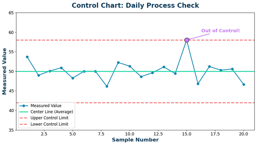
A control chart tracks a process over time and shows whether it is stable or not. It has a center line for the average, along with an upper and a lower control limit. As long as the points stay between the limits and do not form odd patterns, the process is considered “in control.”
When to Use a Control Chart
- When you need to watch a process continuously, not just once
- When you want to catch problems early, before they become big
- When you need proof that a process is stable and predictable
Simple Example
A juice factory checks the sugar level in every batch and plots it on a control chart, as shown above. One day, a point jumps above the upper control limit. This tells the quality team right away that something changed, such as a new supplier or a machine setting, and they can check it before more bad batches are made.
6. Scatter Diagram
A scatter diagram, also called a scatter plot, shows the relationship between two different things. Each point on the chart represents one pair of values. If the points form a clear pattern, such as a line going up or down, it suggests the two things are linked.
When to Use a Scatter Diagram
- When you want to check if one factor affects another
- When you need to test an idea before making a costly change
- When you want to show a possible link between a cause and a result
Simple Example
A call center wants to know if longer training leads to fewer customer complaints. They plot each employee’s training hours against their complaint count. The scatter diagram shows that employees with more training hours tend to have fewer complaints, which supports the idea that more training helps. Note that this only shows a link, not final proof, since other factors could also be involved.
7. Flowchart (or Stratification)
Some lists of the 7 basic quality tools use a flowchart, while others use stratification. Both are useful, so we cover them together.
Flowchart
A flowchart is a diagram that maps out every step in a process, using boxes and arrows. It helps teams see the full picture of how work flows from start to finish, which makes it easier to spot extra steps, delays, or confusing handoffs.
Stratification
Stratification means sorting data into smaller groups so patterns become easier to see. For example, splitting complaint data by store location, shift, or product type can reveal a pattern that was hidden when all the data was mixed together.
When to Use These Tools
- Flowchart: when you need to fully understand or redesign a process
- Flowchart: when new team members need a simple guide to the workflow
- Stratification: when a chart looks messy and you suspect hidden groups inside the data
- Stratification: when comparing performance across teams, shifts, or locations
Simple Example
A clinic maps its patient check-in process on a flowchart and notices that patients pass through three different desks before seeing a nurse. By combining two of these steps, wait time drops noticeably. Separately, when complaint data is stratified by shift, the clinic finds that most complaints happen during the evening shift, pointing to a staffing issue at that specific time.
How to Choose the Right Tool
You do not need to use all seven tools every time. Most quality problems can be solved using just two or three of them together. Here is a simple way to think about it:
- Start with a Check Sheet to collect clean, organized data.
- Use a Pareto Chart to find which problem to fix first.
- Use a Fishbone Diagram to find the root cause of that problem.
- Use a Histogram or Scatter Diagram to study the data more closely.
- Use a Control Chart to check if your fix keeps working over time.
This simple order works for most projects, whether you run a factory, a hospital, an office, or a small shop. For a deeper look at how these tools fit into a wider quality improvement process, the free guide from the American Society for Quality is a good place to continue learning, along with the ISO quality management overview for a broader view of quality standards used around the world.
Frequently Asked Questions
What are the 7 basic quality tools?
The 7 basic quality tools are the check sheet, Pareto chart, cause-and-effect (fishbone) diagram, histogram, control chart, scatter diagram, and flowchart (some lists use stratification instead of flowchart). These are simple tools that help teams find, understand, and fix problems using real data, not guesswork.
Who created the 7 basic quality tools?
The tools were gathered and promoted by Dr. Kaoru Ishikawa, a Japanese quality expert. He believed everyday workers, not just engineers, could use these simple tools to solve most quality problems in a business.
Do I need special software to use these tools?
No. You can draw a check sheet on paper, build a Pareto chart in Excel or Google Sheets, and sketch a fishbone diagram on a whiteboard. Software makes the work faster, but the tools work fine by hand too.
Which tool should I learn first?
Start with the check sheet and the Pareto chart. The check sheet helps you collect clean data, and the Pareto chart helps you see which problem to fix first. Together, they cover the first steps of almost any quality project.
Are these tools only for factories?
No. Offices, hospitals, schools, software teams, and shops all use these tools. Any place with a process and a goal of fewer errors can use them.
What is the difference between a histogram and a control chart?
A histogram shows the shape of a group of numbers collected at one point in time. A control chart shows how a process changes over time and flags points that fall outside a normal range.
Can one tool replace all the others?
No single tool tells the whole story. Each tool answers a different question, so most quality projects use two or three of them together, such as a check sheet to gather data and a Pareto chart to rank the results.
Conclusion
The 7 basic quality tools are not complicated. A check sheet helps you collect data. A Pareto chart shows you where to focus. A fishbone diagram helps you find the real cause. A histogram and a scatter diagram help you study your data closely. A control chart keeps a process steady over time. A flowchart and stratification help you understand and sort your process and data.
You do not need special training or expensive software to start. Pick one tool, try it on a real problem this week, and you will likely be surprised at how much clearer the picture becomes. Small, steady use of these tools, more than any single big project, is what builds strong quality habits over time.